There are some essential and popular quality management tools that’ve been around since the dawn of time (or at least it seems that way).
Why are they used?
To understand problems better. And to make informed decisions, based on data.
When used correctly, they can help identify issues, trends and root causes, quickly. And provide the often-overlooked element of process improvement and problem solving… that’s using data and facts to eliminate problems for good.
Remember, the usual message is this: When problem solving, you must use inductive and deductive reasoning to really eliminate issues.
This means that you must use judgement and theories, based around data and fact.
And so, using quality management tools helps add the data to your argument.
Add these ingredients to a structured problem solving methodology like DMAIC, or PDCA, and you have a recipe for eliminating improvements for good.
Why are They Called Quality Management Tools?
Most of the quality management tools had their inception from quality management gurus like Deming and Juran (Total Quality Management) and Ishikawa (Quality Circles).
But essentially, they are there to do exactly what it says, implement effective management of quality.
Good quality of processes, people and outcomes, ensures you have less problems as a business.
And it also ensures your customers are delighted with your high-quality level of service.
The effective use of these 13 quality management tools requires the people who run their processes, to use them.
This ensures that the culture is about observing what’s going on and making improvements as second nature.
The 13 Essential Quality Management Tools for Process Improvement (and Problem Solving)
I’ve put together a list of 13 of the best (and most popular) quality management tools that you should use. They consist of the 7 foundational quality management tools, plus 6 more that are good to have in the toolbox. (And which I regularly use myself.)
Here they are in their full glory:
- PDCA / DMAIC (or some process improvement framework)
- Statistical Process Control
- Process Mapping
- Cause and Effect Diagrams (and Cause and effect with cards, often called CEDAC)
- Brainstorming
- Pareto Charts
- Control Charts
- Check Sheets
- Bar Charts
- Matrix Analysis
- Scatter Diagrams
- Dot Plot charts
- Histograms
Before using any quality management tool, you need to have a framework to use it all within. It’s like having an operating system with your laptop. The operating system ensures that you get to use the computer for all its capabilities and effectiveness. And Use it in a structured way.
That’s why we start with the use of a process improvement framework.
Process Improvement Framework
There’s no point going gung-ho, without a way of understanding what to do when you find a problem.
The best way to tackle problem solving and process improvement is through a structured problem solving process. This has been covered in other articles, but some of the most popular methods are:
- Plan-Do-Check-Act Framework
- DMAIC Methodology
Each one provides a clear roadmap of what to do to tackle problems and eliminate them for good.
And once you have your framework in place, it’s time to use some other tools.
Here’s a brief description of the remaining 12 quality management tools and why you should use them.
Statistical Process Control
Or SPC as its commonly abbreviated to. It’s one of the 7 ‘foundational’ quality management tools. It’s a framework for measuring and reducing variation in a process’ output.
Variations in processes cause all sorts of inconsistencies from product quality, to lead time, to cost, and even attitudes and behaviours.
Variables cause the most common quality problems in processes. By that I mean, something(s) that’s causing a process to be hugely inconsistent. One minute you get it right. The next, it’s producing nothing but poor output.
And the theory goes that by controlling these variables in any process, you can control the outcome. Thus, making it more consistent.
And with consistent output comes stable processes.
And with stable processes, you get less time spent firefighting and handholding things through that process.
You also get great confidence it in being right every time. Thus, you can even offer services that your competitors can’t.
The automotive manufacturer, KIA have a 7-year warranty on all their vehicles.
Why? Because they are so confident that their cars are produced to such a high and consistent standard… They’re willing to put their reputation on it… and tell the world about it… And win more customers, too.
SPC is a way of measuring the quality within a certain process. This data is tracked normally using a Run Chart (or control chart).
The reason for using SPC is that you get real time information to see how stable the process is and can:
- reduce variability and defects
- improve productivity
- Reduce costs and lost time through firefighting
- Uncover hidden process trends
- Instantly react to process changes and variation
- Make real-time decisions in the business
Should every process be measured, using SPC?
No. It would be too much effort and cost to measure absolutely everything to the nth degree. And its overkill.
The biggest impact would be to measure your key processes. This means that you’ll probably want to understand 5-6 of your business’ critical processes better.
Control Charts
This is the second of the 7 foundational quality management tools. Control charts are one of the main methods of measuring SPC.
It’s an easy way of showing trends over time, and how a process is performing.
And whether it’s in control or not. On a Control Chart, you’ll find upper and lower control limits.
These are statistical indicators that show whether the process is statistically in control.
If it isn’t, it’s time to get to work to stabilise the process.
That stabilisation means you need to find the root causes of that inconsistency.
Control charts use the mean and standard deviations to measure whether a process is statistically in control or not. And if it’s not, it’ll show you when it’s happening.
Here’s a very simple version of a control chart (below) measuring output over time.
Notice how easy it is to see if, and when it’s out of control?
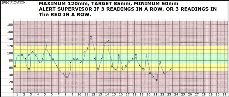
Control Chart
Process Mapping
One of the first steps to understand a process is to map it. By mapping, we can gain a picture as to what actually happens.
Not what we think or what should happen.
This give us a tremendous insight into the process and what’s going on. And where the potential issues are that may be affecting the output and inconsistencies in our process.
ICOR is a great tool to help do this. ICOR stands for:
- Inputs
- Controls
- Outputs
- Resources
By looking at the inputs, controls, outputs and resources, we can see clues to help us find the reasons for inconsistency of output.
An Example
Let’s stop for a second. Let’s assume that we’re measuring a critical process’ output.
This process is a Valve making process.
The process involves some machine work, pre-assembly and assembly work as well.
The Valves must not leak in test. And as we measure, our control charts are showing that there’s too much inconsistency. Some pass and some don’t.
We can stop and tackle the problem there and then.
And often one of the first things we’d do, is to map the process, to see what is happening when we observe it.
We want to detect any potential issues that we can bring forward to investigate further. And either dismiss or prove that it’s having a potential impact.
If you take this example, and using ICOR… our map would have several factors that go into the whole process. 1 or 2 of these factors are causing this inconsistency.
And by mapping it all out and observing the process, first, you can see potential problems and factors to investigate further.
And the beauty of this is that it gives you so much to think about… So many clues to investigate and ask questions…
Before any assumptions or further actions are made.
Here’s an example of a process map (This is an interpretation and not the only interpretation of a process map):
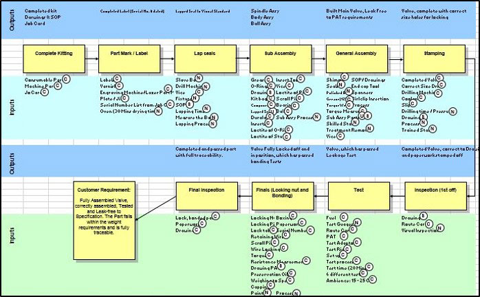
Process Map Example
The yellow boxes are simply steps in the process. Above each step is the required output for each step (in blue). And the green section below represents all the inputs to that step. Notice that each input is labelled either C = Controlled; or N = not controlled.
This is important. It allows us to see how well each input is controlled to prevent variation and issues and gives us clues to see what may be impacting our process. And where we need to tighten things up a little.
Some factors worth investigating further, in our valve manufacturing example, could be:
- The raw material thickness may be too inconsistent, which prevents a stable output in our business
- The environment. The humidity or heat may affect the CNC machine
- The way the operator places the material in the jig
- Is the jig stable or does it move slightly?
- What about capability of machine? When was the last time it was serviced and looked after?
- What’s the skill requirements of the job?
- Is the operator skilled enough and had adequate training?
- Are the seals being damaged during assembly?
- Is the lapping process needed?
- Does the lapping cause undue variation?
- Is the tool moving?
- Is the tool blunt?
- Can we see when the tool is about to lose its sharpness?
And so on…
In one map, you can see the process, the inputs and the clues as to what could be causing this variation, all on one sheet.
It allows us to break the process down into small segments, and see how they all fit into the bigger whole or process outcome.
Cause and Effect Diagram
The Cause and Effect Diagram is another one of the 7 foundational quality management tools. I’ve written an article on this before, but an adaptation on the classic Fishbone is the CEDAC method.
This stands for Cause and Effect with Cards. This method helps you add observed data to the fishbone diagram and then add improvement ideas to that section.
Effectively, you have two cards, one is the idea for improvement; the other is the data card.

CEDAC Fishbone Diagram
With CEDAC (Cause and Effect Diagram with the Addition of Cards), the effect side of the diagram is a quantified description of the problem at the fish head.
In The cause section (the spines of the fish) there are two different coloured cards for writing the facts and the ideas.
The facts are gathered and written on the left of the spines, and the ideas for improvement on the right of the cause spines.
The team then evaluate them and select, based on feasibility and impact in improving the problem.
You can use the Fishbone Diagram or CEDAC alternative to help identify root causes, using data.
In our Valve example, we may take a few subjective ideas from our map, and drill down to find potential root causes and improvement ideas, using several CEDAC diagrams.
Brainstorming
Brainstorming is another core member of the quality management tools suite. It’s used with a team to generate ideas, quickly and effectively.
It can be used in conjunction with identifying root causes through 5 why sessions and using the cause and effect diagram.
In fact, it can be used just about on any subject where you have a small team analysing something.
And it’s a structured way of getting input from the team. And doing it effectively.
The easiest method is to get each team member to write their ideas on post it notes.
One post it per idea and in a short space of 5 minutes, get them to write as many ideas as possible.
Add these to the chart (fishbone diagram, ideas board, etc.).
Then discuss. Group the post its that are similar.
Then ask for another round of brainstorming (if they have more ideas)
When the team run out of ideas, get them to agree their priority thoughts and actions by each scoring their top 1-3 ideas.

Brainstorming
Why use it? Each member of the group inputs their ideas of potential root causes and improvement. Using this method, no idea is a bad idea.
The object is to get as many ideas out on paper, quickly, until the group runs out of thoughts. At which point, it’s then a case of assigning priorities and actions for the ideas chosen.
Pareto Analysis
Pareto analysis is based around the 80/20 rule, whereby often the vital few things cause the biggest effect.
That’s 80% of sales come from 20% customers…
80% of defects come from 20% root causes…
And so on.
It might not be exactly 80/20, but you’ll find that the vital few things cause the major effect.
It’s simple in its approach.
And it’s depicted in the form of a bar chart, whereby frequency or impact is show in descending order, against specific cause codes, or reasons of failure / problems.
Using this method, you can quickly, see the biggest impact from the vital few causes.
And once you have this information, you can get to work improving the vital few root causes.
Here’s as an example of a Pareto Chart:

Pareto Chart Example
Check Sheet
Check sheets are another simple but effective means within the quality management tools suite.
Check sheets are simple tally charts, typically showing the number of occurrences things happen.
Data is collected and ordered by adding tally or check marks against predetermined categories of items or measurements.
It simplifies the task of analysis.
Once you find a problem affecting the process, tick it immediately. Employees refer to the check list to understand whether changes incorporated in the system have brought permanent improvement or not.
Improvement teams can use it to gather important information for further analysis, too.
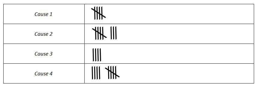
Check Sheet
In our Valve example, let’s suppose that after we’ve mapped the process, and we want to see how many times over the next month, these variables happen. We can do it using a Pareto Chart.
First, we could create a simple check sheet that the operators tally when they spot an occurrence of the problem, in a similar way to the above chart.
Then we can collate this information into a nice visual tool like the Pareto, which’ll show us the biggest offenders from the data gathered…
We’ve now got an even better understanding of our processes.

Bar Charts
Bar charts are another of the 7 foundational quality management tools. They are a very simple way of demonstrating data; the height of each bar shows the frequency of the result.

Bar Chart
Again, in any form of communication, the less complexity the better, and Bar Charts are a very simple way of showing results of data.
Here’s a case in point. What’s easier to read?
- A list of data, collected from source.
- Or a bar chart summarising that data, visually?
Which one is easiest to read?
Which one can you use to spot trends?
It’s a no-brainer, right?
Bar charts are a good way of measuring lots of data, quickly and easily.
Bar Charts could be used in the following examples:
- Expenditure each month
- Delivery performance each month
- Attendance scores
- Customer returns / complaints each week
And so on.
In our Valve example, it could be that we just want to measure number of failures each day, or defects per shift. (So we can see if there is a variance caused between shifts).
Matrix Analysis
A matrix analysis is a simple way of showing the relationship between two data points.
Here’s an example of a matrix to help select the right improvement project, using Ease and Impact as the two correlations:

Project Selection Matrix
Again, notice how clear it is to decipher?
If you’re about to choose the right improvement project, you’d choose from the top right of the matrix (high impact and relative ease to implement).
In our Valve example, we may want to take all our identified variables from our ICOR process map and feed them into a cause and effect matrix.
We can then score each factor based on importance to our customer.
What we can then do is filter out the high scoring factors from the low scoring ones. And then bring these high scoring ones forward for further analysis.
Using this method, we can plough through our ideas and observations quickly and effectively. And, highlight the biggest impact variables from the rest.
Here’s what it could look like if we sorted all our valve production variables in a Cause and Effect Matrix:
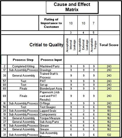
Cause and effect matrix
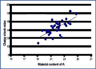
Scatter Diagrams
A Scatter diagram aims to show a relationship between two variables. And how one changes in relation to the other.
Why use a scatter diagram?
In lots of cases, we make judgements based on what we see, and often assume that because one thing happens, and so too another at the same time, then they must be linked.
For example, two customer returns have been received in the last week. When we quickly look, we find that both jobs were manufactured on the night shift…
It’s very easy to say that there’s a fundamental link between quality and the type of shift that produced it. But there could just be other factors that we don’t see that are causing it.
And it could also have been a coincidence that both happened on one shift.
Here’s an example of a scatter diagram:
Scatter Diagram
A scatter diagram can help by collating data over time to see if these variables are linked.
In our Valve example, we could pair factors together to see if they do indeed correlate. This correlation could help identify the root cause and how we can go about controlling them.
In this example, we may have uncovered that the thickness of the raw material has a direct correlation to whether the valve leaks or not… this analysis will give us greater understanding of the process… and how to control the leaks.
We now know more and can make a more informed decision.
In statistics, there are many coincidences that happen, and using scatter diagrams helps to see how correlated they are, before jumping to opinionated conclusions.
Dot plot Charts
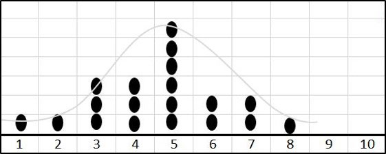
Dot plots can be used to keep plotting output from a process that you’re measuring, using a simple dot for each occurrence.
They’re a great way of showing the dispersion of data and how far the data spreads across values.
You can also use it to see if the process is random or whether there is special cause variation.
By random, you should be able to see a bell curve in the data (which normally signifies the process being stable).
Here’s an example:
dotplot chart with bell shape
In a lot of instances, if you get something other than a bell curve, there may be special cause variation and additional factors that are caused big variation in the process output.

(This is a big subject, and will be touched on in other articles, so stay tunedJ)
A simple way of thinking about this tool is when using dice. You can easily set up a dot plot to count the number of times the dice falls on each number, when rolled. Because the dice can only be either a 1, 2, 3, 4, 5, 6, you can plot them at the bottom of a dot plot and add a dot for every occurrence the dice falls on each number.
Histogram
Histogram is a graphical representation showing the intensity of a problem.
They’re classified as one of the foundational quality management tools.
Histograms are like bar charts and dot plots but they group numbers into ranges.
In a similar way to the dot plot, histograms help identify the causes of problems in a process, by both the shape and width of the distribution.
What separates them form the dot plot is that the histogram should be used for larger data sets. This is because the data ranges can be grouped together.
In the case of our Valve example, we may want to measure the size of every Valve being produced.
As it’s continuous data that can have be any size measurement (and not pre-set sizes like our dice example) the histogram could be used instead of the dot plot. Because data ranges can be grouped at the bottom of the axis.
For example, our size ranges might go:
- 20-29
- 30-39
- 40-49
- 50-59
- 60-69
- 70-79
- And so on…
We can now add the number of occurrences to the histogram.
By measuring this, we can add upper and lower specification limits to the graph. These specification limits show the tolerances as to what’s good quality and what’s not.
Like the dot plot, you can then gauge how much of your process output falls within acceptable limits.
If the distribution is too wide, you can set about improving it.

Histogram with ucl and lcl
In this example, we can see that much of the output from the process, falls outside of the upper and lower control limits.
The distribution is too wide.
And the mean is slightly skewed to the lower end.
The result being that there’s a high number of defects. And there’s plenty of analysis to do to narrow the distribution and control the process.
Use These Quality Management Tools to Suit Your Needs
These are the 13 common quality management tools to use in analysing your processes and problems.
Notice how they can all work together to give you greater insight BEFORE finding the root cause(s).
Use them within a proven problem solving methodology (as in step 1 above), and you have a powerful way of measuring and improving your business.
Do you have to use all the tools every time? No. You simply use what you need, to get to the root cause.
Some problem-solving projects may require extensive analysis, using even more tools than these 13 quality management tools.
Others may need just 2-3 of them.
The important thing is to use data to understand processes and problems to drive problem solving.
